ART

CARTOONS
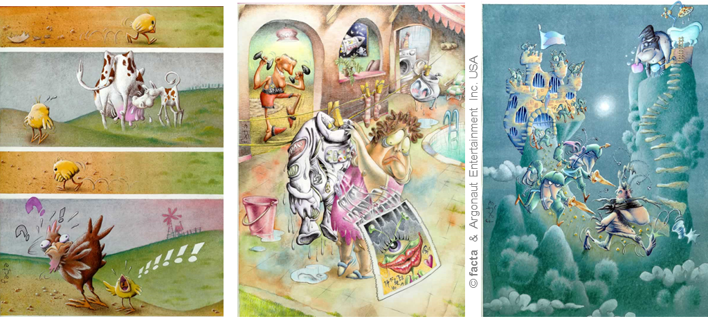
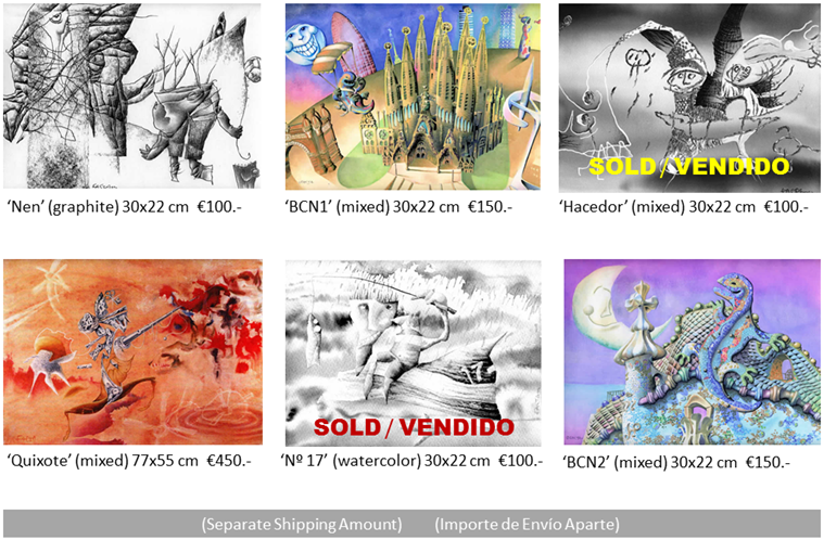
Our cartoons are known in several countries, published by hundreds of newspapers and magazines… let’s share some of them with you! (regularly renewed) LIFE IS BETTER WITH HUMOR
‘FACTA NON VERBA’
This famous ‘facts, no words’ latin saying suits so well these samples of our satiric-art production from old past in the field of silent-humor (without words, precisely).
Hope they can still bring a smile to you today!
CREATIVITY
The permanent will of improving, innovating, providing new + effective solutions is our ‘way of’ in art, education, advertising, or business. We are firmly convinced about CREATIVITY being a magic ally to be IN THE VANGUARD.
‘RIGHT UP MY ALLEY’
Creativity defines good part of our professional life in ‘bf©’, and is one of the less studied topics in science, except for some brilliant research in Harvard and some other institutions.
Normally, the first blocking barrier for ‘non-creative’ people is their conviction about not being creative: we’ve always preferred to go forward looking for the exciting ‘first time’ to happen.
Some of the fields we’ve been creatively involved in, together with respective examples:
CRAFT·ART
The ‘hands-on’ experience with the material (paint, graphite, ceramics, paper, cloth, or whatever you can think) together with the power of imagination, can change our life. We play and teach this ‘game’ gladly to whoever wanting to join and IMPROVE THE WORLD WITH SHAPES AND COLORS
ART & PART: BE PART OF ART!
Let your inner artist get expressed in the way you prefer …we’ll feel delighted while accompanying you in this endless growth journey.
Otherwise, you can simply buy our stuff! (thus contributing to our diverse projects on research and development in culture, science, and art). Keep an eye on this!
BUY NOW & HERE!
ART·NIMATION 😃
REMEMBERING THE JOY OF MIXING DIMENSIONS ⬜🎲😀
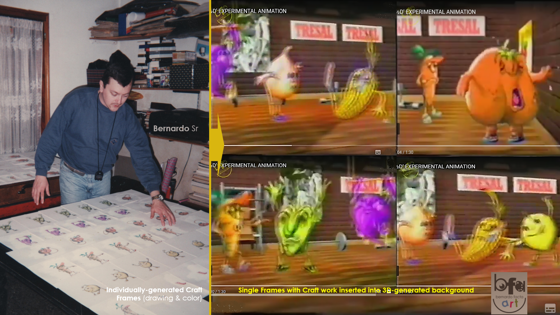
‘Once upon a time…’ we were wanting to discuss the dimensional tyranny.
In short, we created sequences of frame-x-frame (drawing by drawing) character movements and expressions in order to insert them into virtual, 3D animated backgrounds.
Being the artisanal side my main task, Alexandro Irusta was in charge of the technological final cut. Animation is, fortunately, a Team-work almost always.
The main goal for this experimental project was to add bit of ‘life’ and expressiveness to a field (3D in general) that was still too geometrically-cold at that moment.
And to have a lot of fun in the meanwhile!
‘Til the Next one…
B (Sr)
GRAPHIC MEMORIES…
ABOUT PRIZES, FUN & PROTOCOLES 😃
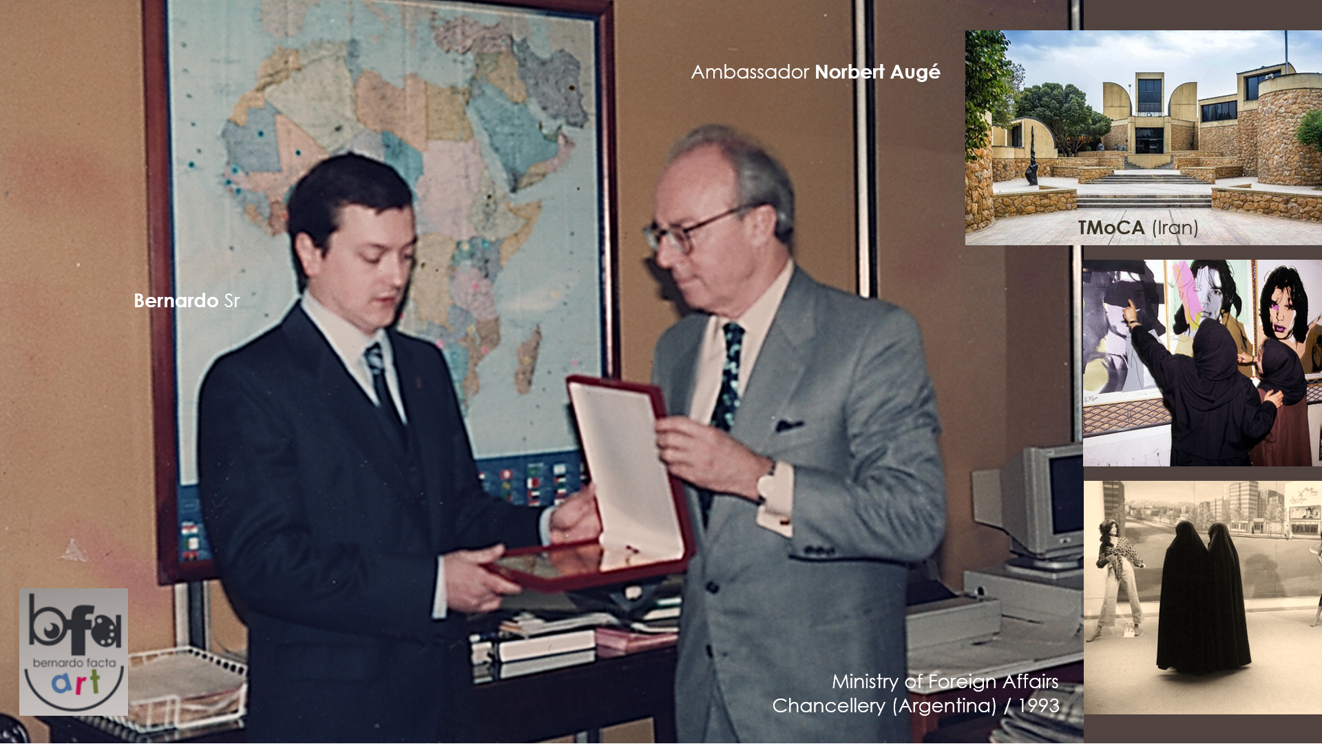
In the image, a “seriously very happy” Bernardo Sr. receives the 1st Prize of the press illustration contest that took place at the Tehran Museum of Contemporary Art (Iran), 30 years ago.
Ambassador Mr. Norbert Augé, diplomatic and cultural responsible for the Sub-Saharan Africa area of the Ministry of Foreign Affairs (Bs. As., Argentina) presents the corresponding plaque and medal. There was also, fortunately, a cash prize that the international organizers transferred while remembering that ‘man does not live by art alone’ 😊
Joke aside, the need to respect diplomatic protocols was a condition that I will remember as much as the prize!
Being myself an international editor of WittyWorld Publications at that time, the repercussion of the contest and prize was very pleasant, always deserved by that popular ‘other art’ capable of inviting readers to reflect from a magazine, newspaper or book page.
Each recognition or award means hours, days, months of hard work in search of ‘that’ idea that makes people think and laugh at the same time. And even so, it is very difficult to stand out among so many international geniuses of satirical graphics, humor and illustration for the media. So thankful, then, for my few ‘happy winning times’ 🙏
Eternally grateful, in addition, to humor and art that have made me so happy throughout my life, both when I have won prizes and when I have celebrated my extremely talented colleagues doing so (mainly ‘cause I’ve learned a lot from them) 😊🎨
‘Til the Next one!
B (Sr)
MEMORIES…
TÀPIES, SANT JORDI & UNFORGETTABLE ART MOMENTS
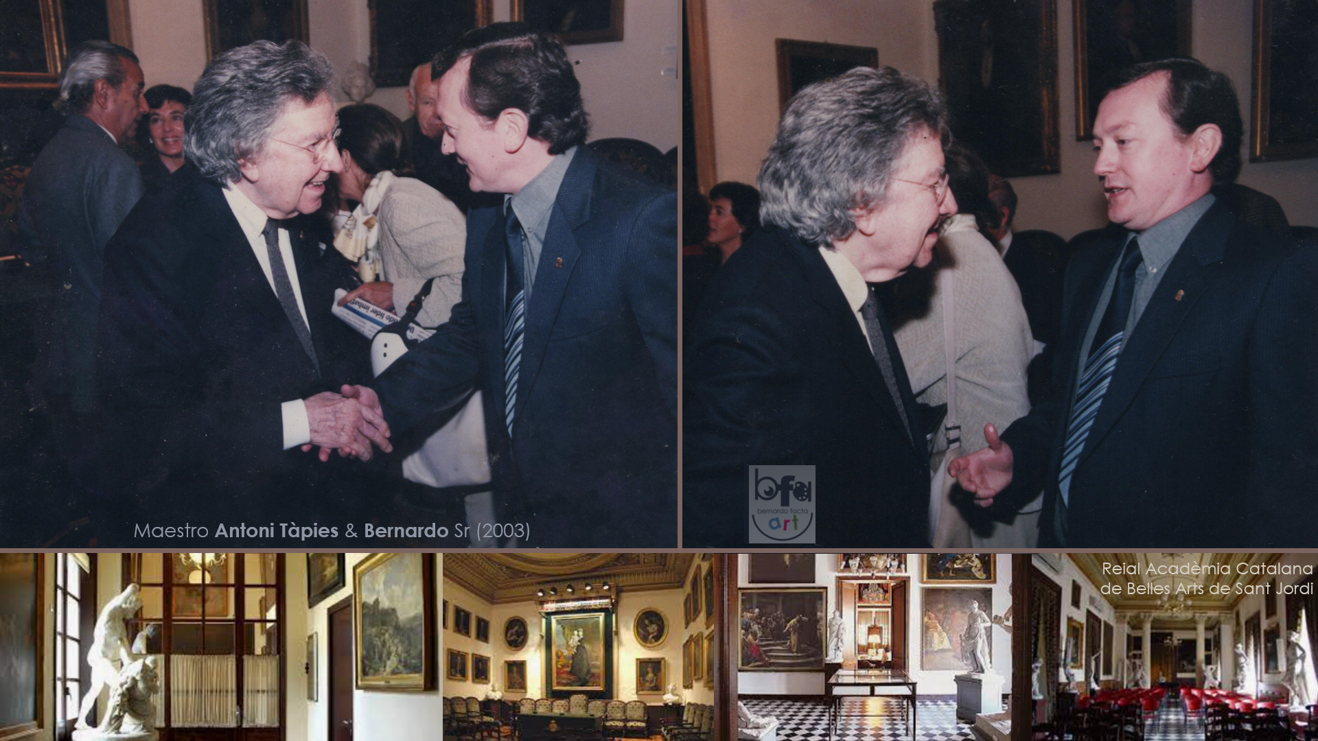
Better than treasuring memories is keeping them alive within one. This is how I have tried to do with the wonderful moments lived as a member of the Reial Acadèmia Catalana de les Belles Arts de Sant Jordi, for 20 years now.
Talking animatedly about art (and learning a lot) with the late Maestro Antoni Tàpies (photo) or being considered by Leopoldo Gil Nebot (Coordinator of the Academy at that time) for numerous Congresses, events and exhibitions, are gifts that I appreciate every day.
Tàpies is certainly one of the greatest names in contemporary art and, fortunately, his masterpieces can be enjoyed in many galleries and museums around the world, including his Fundació Antoni Tàpies at Aragó Street in Barcelone.
The Academy, b.t.w., keeps being a beating heart of Catalan artistic activity nowadays, with events around painting, music and many other artistic expressions in permanent support of relevant artists and a public ‘thirsty of good art’.
A privilege + honor to have been integrated as a Member of such a significant institution, and lot of growth from the beginning thanks to its permanent contribution to the Catalan society.
Time passes and what it gives us, better if it is well preserved and building us at every moment 😊🎨
‘Til the Next one!
B (Sr)
LOGO DESIGN
ART & BUSINESS TOGETHER 🙂
![]()
Lot of people told us they love our logo, what we truly thank for, as it’s an important side of the whole thing.
A logo is usually ‘the essence’ the something it represents: a brand, a company, a club, an institution, etc. So: it should really BE the represented stuff in visual + graphic terms.
Difficult task! Any designer will agree on this. In our case, after years involved in advertising (both from the art and creativity sides), it was a matter of putting the best of ourselves in the task.
Huge advantage: we were the designer and the client at the same time 😊
On this will every designer agree too: sometimes the most difficult task is to interpret the essence to be represented or, even worse, what the client feels and wants on this respect.
Cool. About bf© it has been a matter about creating a logo that should be original, funny, clear (easy to interpret by viewers), humanized and structured enough to be reproduced as exactly as possible in different context whenever it comes to.
The ‘human’ thing came in the form of an evoked face where the ‘b’ circular part acted as an eye (with or without eyeball inside), as well as the copyright symbol (adding a sensation of credibility) seemed the other, blinking, eye. The inner ‘c’ is supposed to be getting this blink to the visual interpretation when in context together with the rest of elements.
The bottom half of the center ‘f’ came from knobs to go through a nose and the semi-circular stroke / line under the text (identification) gives ‘aesthetic closure’ and offers the feeling of a big, confident smile at the same time. Let’s remember Nike or Amazon using similar principle in even more ‘organic’ (or less geometric) way.
With the ‘human’ part solved, we thought that the ‘big smile’ itself gave a sufficiently ‘funny’ spirit to the thing. For the ‘clear’ aspect we thought that the letters’ definition and highlighting offered enough strength to the meaning-transmission, and (finally) the ‘structured’/replicable condition was provided by the choice of fixed fonts and graphics with exact proportions to each other, juxtaposed further in an intentionally calculated way.
As a whole, we hope to have created an ‘original’ visual product. It seems that the ‘likers’ of it appreciate, at least, a certain beauty, what makes us feel so happy 😊
Recalling the characteristics that, according to orthodox theory, a good logo should have (simplicity, representativeness, scalability, pregnancy, originality, durability and relevance, among others) I would like to highlight that in terms of ‘pregnancy’ (generating capacity, let’s say) we took advantage of our generic logo’s one to detach from it the thematic-specific derivations (training, coaching, science, business, etc.) following the aesthetic lines of the original.
![]()
Upper image: main bf© logo and thematic derivations/ This pannel: 1. Previous ‘bf’ logo (for ‘bf animation art’). 2. Opening page of ‘bernardofacta.com’ with composed insertion of logo, colored in yellow to combine with predominantly-grey background. 3. Visual adaption to greet our public for Christmas (taking advantage of the face-like appearance of our logo, that ‘becomes Santa Claus’ in this composition).
For the rest, each viewer is a judge, so: there they are (our logos) for you to perceive, judge and express yourself in case of needing/wanting. All comments accepted and appreciated!
In summary, to anyone wanting to design a logo, I’d suggest first to ‘feel’ it deep inside, to vibrate together with the essence of what it’ll represent, in order to identify Self with this essence, then to match the respective design.
‘As simple as possible’ could be the following point: Nike’s simple curve stroke is considered among the best three existing logos …it has to be for some reason.
Good if a visual image with impact (original) and capable of being adapted to multiple purposes, always keeping own strength and unique definition.
Then, good to ask ‘authorized’ people before publishing your work. Others’ opinion can give you the last chance to improve/optimize your creation still in time.
Hope this helped. Full Success with your Logos!
‘Til the Next one,
B (Sr)
VIRTUAL GALLERIES
NON-PHYSICAL SOLUTION TO EXHIBIT + SELL OUR ARTWORK
That’s it! In pandemic times it’s even harder to place pictures, sculptures, installations and every other physical product of our creativity and imagination. Thank God, virtuality comes in our help.
Having had the fortune to show my work in +25 countries (galleries, museums, art centers, etc.), the last physical exhibition happened more than 4 years ago, and when I wondered how to come back on track, famous virus came up to alter everything, art-market included.
I found blessing the possibility of virtually exposing, as it’s usually a window allowing people all around the world to watch our production, and majority of sites permit the artist to sell besides exposing. ‘What else?’
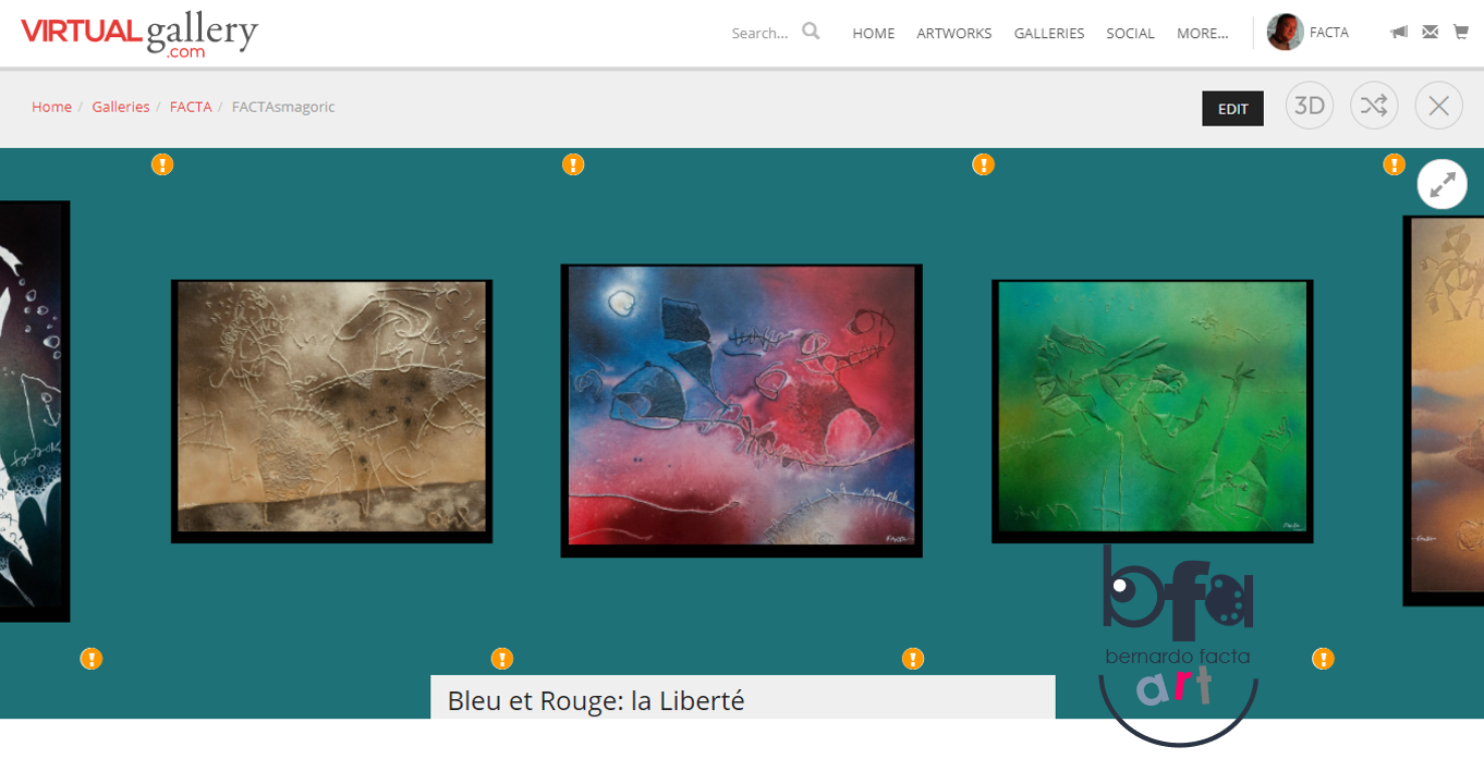
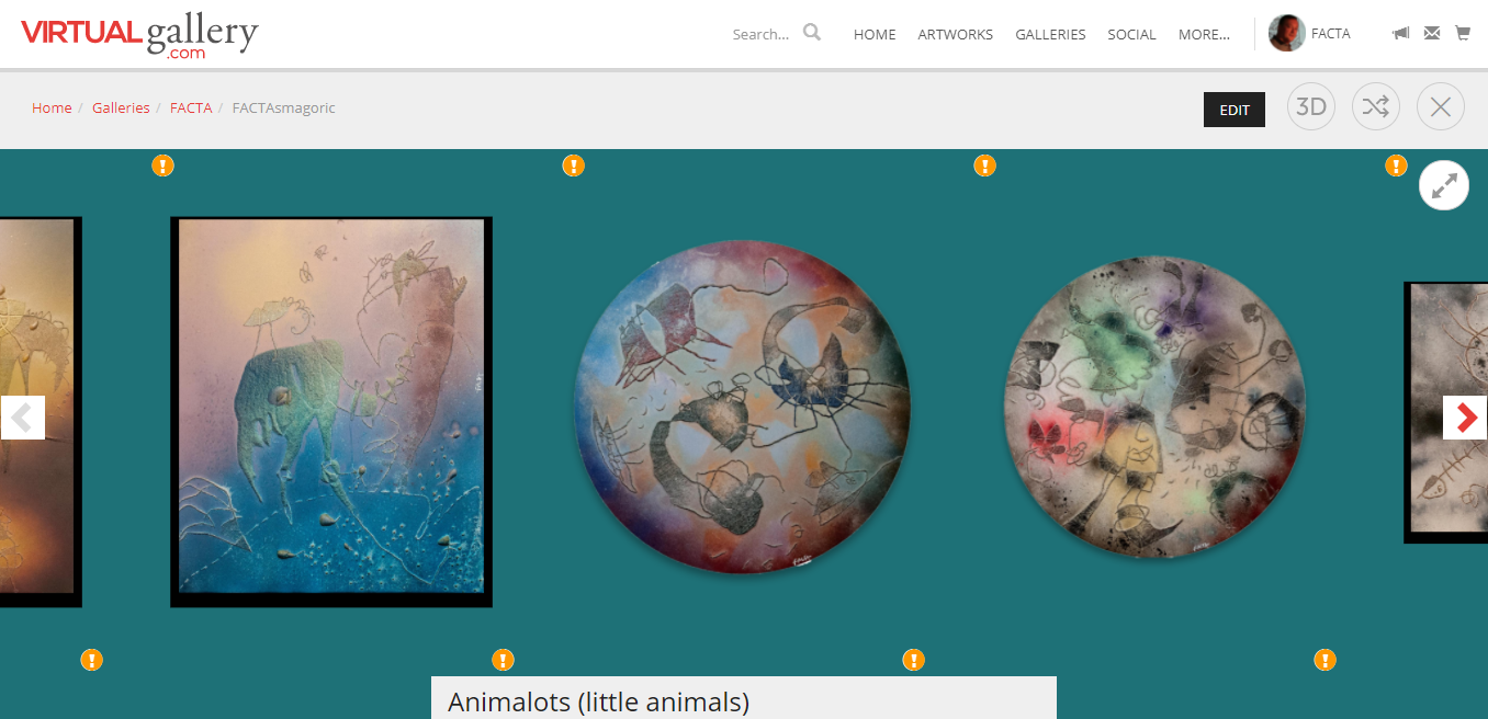
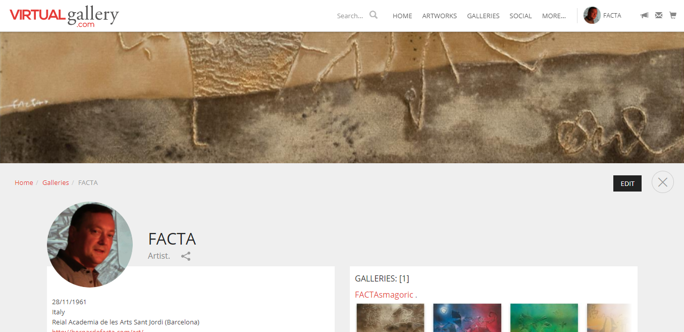
Attached images have been taken from ‘the Virtual Gallery’, where I did the whole experience (inscribing myself and my art, arming a virtual exhibition with 25 pieces, publishing my art CV, adding description to each exposed picture, putting price to them, etc.).
The mother-site keeps usually a little part of the sale amount, as it’s perfectly logical, in kind of compensation for letting both artist and art to gain higher visualization.
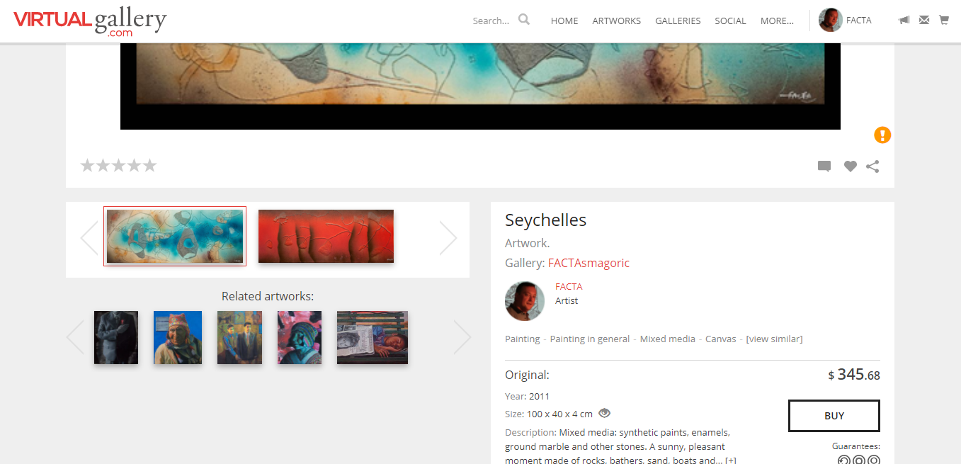
And in case of wanting to choose the best place for ourselves and our specific kind of art, is just a matter of googling (virtual galleries/ virtual art exhibition/ etc.). A nice list of possibilities instantly appears, together with some interesting sites that analyze them in order to give advice.
Hope you’ll expose and sell a lot, dear artistic colleagues!
‘Til the Next one…
B (Sr)
ART·CHITECTURE
SOME MORPHOLOGIC SIDES OF THIS EXCITING PROFESSION
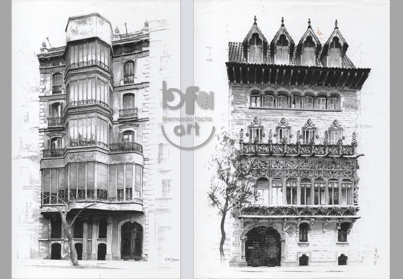
The examples in the previous images correspond to illustration of facades (pencil + watercolors and related techniques) made ‘in situ’ during daytime / evening hours and commissioned by friends who occasionally became clients.
They are central buildings in Barcelona belonging to the same family (or ‘lineage’, since they are Counts of Barcelona) and whose architectural value joins the artistic and historical alike.
I’ve inevitably evoked, when making the illustrations, beautiful times in which the challenges were to design homes, stands, buildings and everything from aesthetic beauty, engineering practicality and, above all, ergonomic habitability (that is: comfortable and adapted to the physical and vital capacities of future users).
Always been fascinated by the ‘morphological’ side of Architecture, I am grateful for university training in this sense, with countless hours of perspective at multiple vanishing points, colorimetry, representation systems, project + design, etc.
I also solved heraldry issues for the same ‘client-friends’, with reconstruction of genealogical illustrations and shields included, although that is another story.
In both cases, however, it has been key to monitor the proportions, the relevance of the chosen colors and the final impression of ‘representativeness’ of a particular state (social, cultural, historical, among other angles), as well as to appeal to the more traditionally handcrafted techniques, which (I confess) I loved! 😊
‘Til the Next one…
B (Sr)
LA ‘NAU GAUDÍ’: CONTEMPORARY ART MUSEUM IN MATARÓ
FIND THE WHOLE REPORT ON OUR VISIT TO THIS CENTER BY CLICKING HERE ![]()
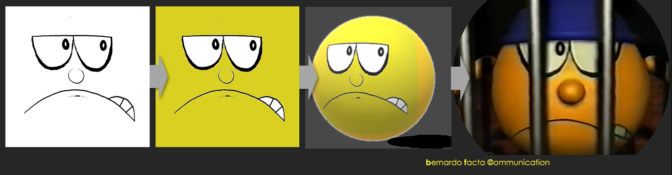
MEDIA-ART (V/End of Series): SIMPLE + MAGICAL 2D
ON THE VAST RANGE OF POSSIBILITIES AROUND THIS EMBRYONIC TYPE OF ANIMATION
Movements. Energy. Expression. Emotions. Intensity. Excitement. ‘Simple’ 2D Animation has been the source of many fantastic moments on TV, cinema, video and similar media since the very beginning (‘Fantasmagorie’, 1908, Emile Cohl).
Former ![]() predecessor of
predecessor of ![]() devoted good part of its reality to animated shorts, many from them in 2D way, even if some other choices moved the project forward alongside its existence. The link to academic audiovisual research on one hand and the complementary one to advertising for media made the whole thing possible, and we enjoyed a lot the unforgettable experience.
devoted good part of its reality to animated shorts, many from them in 2D way, even if some other choices moved the project forward alongside its existence. The link to academic audiovisual research on one hand and the complementary one to advertising for media made the whole thing possible, and we enjoyed a lot the unforgettable experience.
The attached video-sample is a fairly random collection of isolated parts of animated shorts for TV and (in some cases) also video and cinema.
Each job, usually solved at frequencies less than 24xSec (from 6xSec to 12xSec in general) was at the time the perfect excuse to probe into the possibilities of movement and expression, transmitting messages and emotions together, at least from the artistic intention.
In my humble opinion, certain kind of ‘mind plasticity’ is needed to develop such a simple art with that much potential, in order to play with elastic dimensions like time-lapses and dynamic approach to represented space. The animator usually works a lot mentally before ‘getting down to business’, and I particularly enjoyed both phases.
Miss a lot the pleasant, apparently dilettante moments of mind work by squeezing script options and technical + artistic resolution possibilities …as well as my hand would pay a fortune to come back to the light table where to start sequenced pieces of joy (for me, at least, as for the public who knows? 😊).
‘FACTAsmagoric’ was the chosen name for an exhibition of my paintings some time ago. Kind of a tribute to Cohl’s initial spark, it also played with my surname, what easied the task. Anyway, many other ‘fathers’ of this lovely art-in-movement as 2D is deserve my permanent thankfulness (just naming some of them as Disney, Seth McFarlane, Max Fleischer or Friz Freleng, who seem to share this particular Olympus by acquired right).
Changing focus to future, I guess new horizons still wait for good 2D, always trying new script/ artistic style proposals to keep the new public engaged, excited and, if possible, Happy.
Let’s cross fingers toasting on this future that I’d love to enjoy, wishing the best to all involved new artists …and to their public.
‘At home’ we keep always open to new research on many fields including the audiovisual one, every time more useful in support of varied human-growth fields like science, education and others, so… already enthusiastic about the newcoming stuff that we’re making bounce in our minds in this right moment. The hand is, at its turn, sneaking up to the light-table …just in case.
‘Til the Next one!
B (Sr)
MEDIA-ART (IV): ‘2¾D’ ANIMATION
…ANOTHER ALTERNATIVE FOR EARLY 3D IN ANIMATION
Already approaching the end of the ‘Art for Media’ series, good to remember the (old) times in which we wanted to experiment with organic possibilities for geometric environments or, in other words, to render initial 3D animation (bit too ‘automatic’ and cold during its embryonic first years) a bit more ‘human’ 😊
To work ‘outside’ the virtual scenario by handmaking stuff (drawing sequenced expressions for faces, e.g.) and then to ‘import’ this organic contribution to 3D was a choice we worked with, again counting on my sacrificial will of coping with the whole artisan, frame-by-frame 2D work, and on Fernando Paris’ magical capacity to make with IT systems whatever he wanted.
A mini-series of short TV + cinema adverts for TELECOM (a ‘good’ Client in our jargon of that time) was the perfect opportunity to try the thing, and we did it (attached video). In summary, it was another alternative (together with ‘2½D’ already commented in previous report) of mixing some 2D elements with 3D ambiences and scenarios in order to gain expressiveness and organicity.
Adobe Première, 3D Studio and other programs of the time (all of them extremely improved and ‘modernized’ in their nowadays’ versions) were completing the cycle started by pencil-drawn and ink-defined sequences of face expressions (e.g.), always looking for a homogeneous and balanced integration of both dimensions in search of a volumetric (3D) final sensation to be perceived by the spectator.
Today’s technology makes those efforts appear antediluvian and even non-sense, of course. We can now do this type of work at home, easily and with even higher results! A so simple program like Paint 3D is capable of this in ‘zero-coma’, with myriads of others (so easy to get) floating around with similar or stronger potential for volumetric sensations to the viewer.
Just give a try with your laptop or PC! (it can be Apple too, hehe) …and feel as proud as we’ve been long ago by rendering on one hand new image-resolutions for higher organicity and on the other hand our Clients happy for a nice while.
Now new challenges appear in the horizon for animators, designers, and rest of art-related roles in a big animation studio. Perhaps the next level is to compete in appearance with true 3D reality, and I’m literally ‘wowed’ with the current examples on this.
Greetings from animation’s embryo with best wishes of evolving success 😊
‘Til the Next one!
B (Sr)
MEDIA-ART (III): EXPERIMENTAL ‘2½D’ ANIMATION
MERGING DIMENSIONS IN SEARCH OF NEW VOLUMETRIC PERCEPTION+SENSATION
Looong ago, still in ![]() (predecessor of
(predecessor of ![]() ) times, we wanted to make research on alternative ways of showing 3D scenarios, even by using 2D characters to star the thing.
) times, we wanted to make research on alternative ways of showing 3D scenarios, even by using 2D characters to star the thing.
In short, we created sequences of frame-x-frame (drawing by drawing) character movements and expressions in order to insert them into virtual, 3D animated backgrounds. The main goal for this was to add bit of ‘life’ and expressiveness to a field (3D in general) that was still too geometrically-cold at that moment.
The artisan work (each drawing in the sequence) was solved with great time + effort, by drawing, coloring and giving ‘volume’ to each painting with mixed techniques, in which acrylics, fiber pigments and others predominated.
Then all the artwork was inserted on 3D animated backgrounds to complete the integrated sense of volumetry in motion.
And after some necessary, optimizing trials the thing was ready for the show, so we needed the opportunity to access the public screen…
Amilcar Lovino, the leader of ‘Human Touch’ Advertising made everything possible by asking us to create a whole traffic/vial education campaign for TV, with many videos that should be solved preferently in 3D animation. ‘Cool!!!’, we instantly said 😊
‘2½D’ animation (our way of calling the ‘mix’ between 2D and 3D we were experimenting with) was the final choice.
Fernando Paris, a true techno-genius, was in charge of generating all the 3D stuff + inserting the 2D work, using infographic programs of the time like Adobe Première or 3D Studio, and a professional team of speakers + sound specialists took charge of the audio side.
I was the ‘stonemason’ entrusted with producing each handcrafted frame (drawn, painted and ‘volumetrized’), which I did with great joy and enthusiasm. The ideas + scripts were also mine, even if always put at the rest of the team’s disposal in order to look for great optimization ideas (let’s remember that animation is always a ‘plural’ art).
The attached example is a mix of the final result, made ‘Frankenstein’ way by merging many different parts from the 5-videos series, opening the short with a previous ‘trial’ on a commercial product, emitted before the vial campaign.
Hope you liked this nostalgic look at our past in experimentation and media art … a precious part of our vocation was forged there!
‘Til the Next one,
B (Sr)
MEDIA-ART (II): EXPERIMENTAL ANIMATION
MIXING BUSINESS AND RESEARCH IN SEARCH OF INNOVATIVE & ALTERNATIVE PRODUCTS
Since long time ago, in times of ![]() (a predecessor of current
(a predecessor of current ![]() ) we enjoyed the privilege of applying experimental animation to audiovisual adverts, linking this way the permanent will of research in the field of art to professional advertising for TV, obviously sponsored by the brands and firms to be promoted this way.
) we enjoyed the privilege of applying experimental animation to audiovisual adverts, linking this way the permanent will of research in the field of art to professional advertising for TV, obviously sponsored by the brands and firms to be promoted this way.
Between traditional 2D animation (old-Disney, so to speak) and modern 3D one (let’s say Pixar-style) we found a vast territory where to play with different artistic alternatives (modernized George Méliès could be the thing, in a bit arrogant way for the comparison) like the ones on our video above, an integrated edit of three different ads:
- Mix of object, clay, 2D, original color comic (mixed techniques), and 3D effects;
- Cut-out by pixilation with infographic light effects;
- Original acrylic + watercolor backgrounds, 2D and infographic light effects.
Before this gold-opportunity to investigate new ways in depth (including trial-error in the process sometimes) is necessary to find partners ‘from the other side’ (pure business + media) in order to feel legitimated for the innovative task.
In our case, we agreed on production of experimental animation for TV + Cinema with advertising Agencies, their Clients, and (less to negotiate usually) the media themselves, where in occasions technicians and other professionals were interested/involved enough to become spontaneous actors in the creation of many audiovisual advertisements.
A ‘third leg’ in the system was at its time the inspiration got from our involvement in academic research (audiovisual for media, precisely) as well as a strong link to other arts’ environments (print media, radio, galleries and museums, etc.).
Anyway, to find in the (extremely-competitive world of) business people open enough for the risk of something unusual (even accepting the percentage of possible success from the novelty itself) is far from being easy. Persuasion + clear exposition of reasons to say ‘yes’ count a lot, together with the short experience on the matter having benefitted others, that can be shown to them as ‘third-party referent’ trigger.
Fortunately, it worked in our case and, in general, all of our ‘risky’, experimental products worked and proved useful in persuading the public to support advertised brands and companies (‘Phew’).
A necessary counterpart for LOT of work alongside the research + production time.
Bit more detailed: the first involved animation (from this article video) required the physical, handmade construction of the vessel (a caravel) in wood, rigid cardboard, metal, cotton and other material. In addition, a true colored comic page with a drawn story starred by the Buccaneer (main character) had to be made and solved with pencil, acrylic, fiber markers, oil-pastels, etc. Special mention for the 2D wavy sea that composed image mixed with the caravel and other physical objects (animation created by hand frame x frame, using pencil drawings, inked by hand and painted by computer).
Second animation was based on cut-outs, for what every single element from the many ones appreciated in the film had to be created and cut out by hand and then placed in the horizontal set (huge tabletop) and moved frame by frame, taking each image with an overhead camera. Afterwards the rhythm was established by the insertion of every image according to the necessary (perceptive) speed, sometimes re-structuring pace, speed, etc. (pixilation).
The third one is more an insertion of backgrounds made in traditional pictorial techniques such as watercolor, acrylic, oil pastel, polychrome graffiti and others. Their combination with foreground 2D and edition process by infographic programs (mainly for light effects and creation of zoom sensations) completed the thing, together with the always influent sound channel (replaced by a comprehensive background melody for all three animations in the attached video).
Inspiration for this type of work came at these times also by impressive artists from East Europe and Asian countries, among others (bit more exceptional) from the rest of the world. And of course the possible techniques to apply remain, still today, almost endless.
A creative, open mind will always search for broken boundaries (typical ‘divergent’ thought and process of information), most probably needing to find a practical-analytical mind (‘convergent’ side) to partner with, in order to be able to produce commercial-friendly (still so creative 😊) stuff with potential for media emission. Otherwise, cinema-art is always there and without the business-pressure of ‘how much we have to invest + how much we will win’!
Renewed thankfulness from ![]() , now
, now ![]() , to Alexandro Irusta for the whole technical support from camera-recording to some of the audiovisual special effects, to Human Touch©, Grupo Solo Advertising©, Relaciones© Servicios Publicitarios and others having accepted the ‘creative, unusual challenge’ and gone forward until open (TV, Video & Cinema) emission of our animation short films. Umpteenth thanks also to Xavier Navès and his CINESCAN studio for rescuing from atavistic, antediluvian video-files the attached video-example and others, true technological ‘miracle’ given their extreme damage due to decades of degradation.
, to Alexandro Irusta for the whole technical support from camera-recording to some of the audiovisual special effects, to Human Touch©, Grupo Solo Advertising©, Relaciones© Servicios Publicitarios and others having accepted the ‘creative, unusual challenge’ and gone forward until open (TV, Video & Cinema) emission of our animation short films. Umpteenth thanks also to Xavier Navès and his CINESCAN studio for rescuing from atavistic, antediluvian video-files the attached video-example and others, true technological ‘miracle’ given their extreme damage due to decades of degradation.
Hope you liked! Just in case, we’re already working hard to share more stuff on the subject.
‘Til the Next one!
B (Sr)
MEDIA-ART
AUDIOVISUAL COMMUNICATION FOR ADVERTISING/ TRADITIONAL 2D ANIMATION
Art & Business opposing each other? There are many ways of finding them ‘together’ sharing responsibility for good works that capture the public’s attention and, sometimes, their approval and positive reaction.
In the field of art (or the art market, as we can define the commercial side of galleries e.g.) we can easily find the link between creative stuff and money: ‘I like this picture, I pay for it’.
In the case of mass-media, advertising is usually bringing some doses of intrinsic art that plays the role of attracting attention for further decision towards buying the product or service being promoted: ‘I like this animated spot about pets-food, I’ll buy this food for my dog’.
Creativity + Art + Selling Strategy = Effective Advert = Business
![]() has a business-art predecessor:
has a business-art predecessor: ![]() , which main field of activity has been the production of audiovisual advertising (mainly animated and experimental) for TV, Video and Cinema. In connection to audiovisual departments of universities, the main focus aimed to produce original, artistically-based short animation pieces able to be projected to large audiences by the referred previous channels.
, which main field of activity has been the production of audiovisual advertising (mainly animated and experimental) for TV, Video and Cinema. In connection to audiovisual departments of universities, the main focus aimed to produce original, artistically-based short animation pieces able to be projected to large audiences by the referred previous channels.
2D, TRADITIONAL ANIMATION
Attached example is a 24 sec short film for TV and Video to say ‘good night’ to child audience, so being emitted everyday at the same time (around 10:00PM), usually before prime time for hit shows.
Being sponsored by a large supermarket chain, the main character is the supermarket’s corporate one, indissoluble with its respective brand logo, and the benefit to both (the company and the broadcasting TV channel) lies in the importance of children in each home (they themselves incorporating the image of the supermarket in a sympathetic way + their parents and relatives being ‘contagioned’ by this sympathy too).
The daily reiteration will surely collaborate in the formation of a ‘receiving habit’ and in the subsequent preference towards that distribution chain with respect to its competitors.
FRAME BY FRAME, DRAWING AFTER DRAWING…
Being author of the original script, I did also the ‘artisan’ whole animation work (after approval of the Client’s management) through a friendly frequency of 6 fps (frames per second), what means in practice: 6 black & white handmade inked drawings to scan and color by computer (any simple program like Paint can work for this, if flat color areas involved) in order to get 1 second of animation.
Afterwards the computer edition comes, to create the drawings (frames) series, add sound and eventual special effects, etc.
On the soundtrack, a too short ‘hasta mañana’ (‘good night’, ‘see you tomorrow’, etc.) is the spoken track, done by a media professional, and the overall music that accompanies the character dance was chosen from some half dozen possibilities. Extremely important: the song rhythm was key to determine the visual animation key moments/drawings (since they had to always coincide with each rhythmic beat).
TRIAL & ERROR …SUCCESS 😊
2D handcrafted animation is a really tough work, so the typical science thing about ‘error’ should be solved in the most embryonic phases as possible. So difficult-to-impossible the fact of correcting everything once finished!
CONCEPT BEHIND THE TRACK
Besides the musical-dance proposal to stimulate a friendly reception, the marked use of morphing inside the visual development was both a way to edit and a concept proposal, to take advantage of the rich psychological/perceptive effects linked to this possibility.
In further articles, we’ll go more in depth with the whole thing about ‘morph’ and its huge influence in our perception.
The chosen colors in general were at the same time ‘happy’ (children-friendly, in other words) and as attached to the corporate patterns as possible.
And that’s it! Except for the mandatory mention of Alexandro Irusta, whose technical work in support of my artistic one was ‘the other half’ to achieve the final product.
As almost everybody knows, animation is a type of art involving usually a team, or at least few people. The one-man final products are really rare ones, and almost impossible to find in the field of mass-media advertising.
Last mention to Xavier Navés, whose CINESCAN Studio (Barcelona) was responsible of ‘rescuing’ the video (originally in VHS, Beta-cam and other prehistoric formats) from the antediluvian annals in which it was found (lost in time), for what I am infinitely grateful.
Already said: Team Work 😊
‘Til the Next one!
B (Sr)
HATCHED ART
THE MICROSCOPIC UNIVERSE OF ‘VOLUMETRIC’ LINES
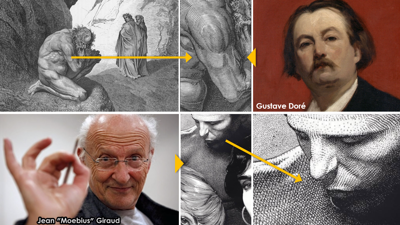
It’s been a permanent love for me: lines. The defining ones that show whole shapes of objects, persons, characters… and the ones that make surfaces and volumes become perceivable for the human eye, and accepted by the human brain as ‘surface’ or ‘volume’, even if they’re suppose to be an inferior category in syntax of visual image respect to ‘plane’ or ‘space’: just lines.
Conditioned by my first publishing experience when I was still a child (12 y.o.) and guided by the editor-in-chief of the newspaper where I was publishing my daily vignettes, ‘nib & ink’ was my first (let’s say) professional technique. My love to lines begun there, I’m pretty sure.
Afterwards, geniuses from the past, like the ‘maestro’ Gustave Doré clearly told me that true pieces of art can be completely performed by lines, not to mention mighty Mœbius (Jean Giraud) as the modern giant referent to me. His outstanding art in the use of lines to define volume (e.g.) completed the work of inspiration for the present …and the future.
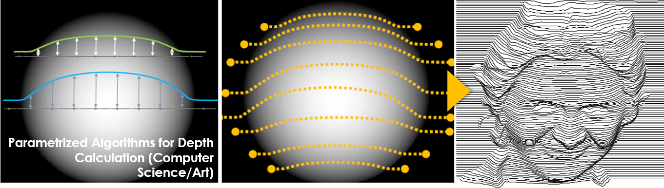
Recently, thanks to frequent contact with different universities, I had access to scientific work around this pregnant art element and how it is capable of performing hatched realities that transmit marvel to our eyes, in the form of black/white differences using textura + volume patterns that guide our perception by knowing how it works in our beloved brains.
Image Example: computer algorithms parametrized to calculate line/curve depths according to given values, in order to perform rendering visual result (a face, in the example)→ (Carleton University, Ottawa, Canada/ Master in Computing Science).
We ‘analogic’ illustrators usually imagine the volume in our (obviously flat-2D) work and cope with line-patterns to suggest this volumetry to the public’s eye.
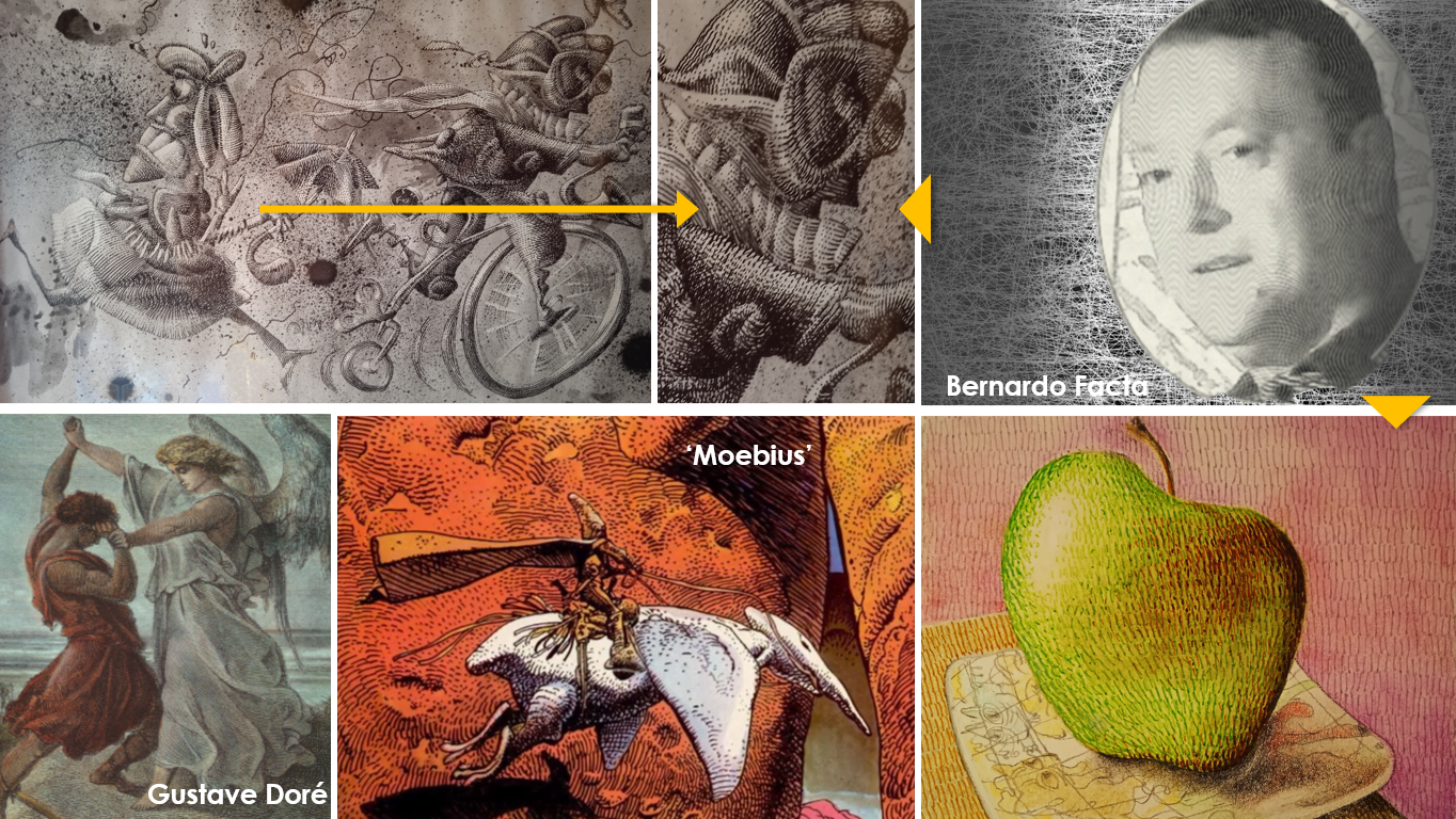
My simple case is about ‘pre-visualizing’ a shape (possibly volumetric) in my mind, drafting it by pencil on a paper surface, imagining an incident light that will build space + volumes, tracing some key lines that will follow the desired volume precisely (acting also as fields where to place the hatching lines afterwards) and moving forward full of enthusiasm until seeing the hatched space + volumes ‘appear’ on the paper surface. I always enjoy a lot both the process and (usually) the final result. Attached, an example of recent work (apple left by my wife on her nightstand)…
My humble innovation here would rely on the use of graded color-patterns for the hatching lines (in coincidence with eventual watercolor basement on the zone) instead of the typical only-black ones. More work to be done, perhaps, even if more fun to me as well 😊
Hope you like too! There’s always there this artist-feeling about pleasing the public’s eye and perception.
‘Til the Next one!
B (Sr)
ART EXHIBITION SET-UP: ELLIPTICAL STORY-TELLING
THE HIDDEN NARRATIVE POWER OF INNER EXHIBITION ORGANIZATION IN ART GALLERIES
True. As well as every picture tells usually a story (conscious or unconscious, and always different for each public), the way all of them are placed inside the physical space is also a matter of ‘narrative’ organization. A big frame containing smaller ones, if we prefer.
Thus, an exhibition curator takes frequent care of this hidden aspect of gallery-art: how the whole will be placed in order to impact the public in a determined way throughout their path from the entrance to what they decide will be the end of the visit.
Sometimes a conceptual ‘glue’ is enough as referential frame to take the physical decisions. Some other times, reasons of chronology, style, used techniques (if a combination of them exhibited) play a relevant role too.
Anyway, like a big jigsaw of sure perceptive sensations to be produced in accordance to the placement of pictures, sculptures, drawings, projections, etc., the final result will assemble things in intentional way, even if (again) the inner process will vary from person to person walking the room/ space.
In some of my last exhibitions I placed a conceptual ‘moto’ or ‘manifesto’ right in the entrance followed by the first piece (painting, drawing, etc.) representing as best as possible the respective ‘spirit’, and followed by sets of other pieces organized, mainly, by applied techniques (oils, acryllics, watercolor, pastel, combinations, ink, etc.).
A thematic diversification coexisted also with the first criteria.
In group exhibitions, similar approaches are usually taken, with intentional selection of artists and their different ways of production in order to arm an homogeneous ‘travel’ or, at least, one with justified sense from the art perspective.
My humble tribute, then, to these ‘artists of art organization’ in which hands rellies many times good part of the ‘perceptive success’ of an art exhibition.
‘Til the Next one!
B (Sr)
GRAPHIC NARRATIVE IN SEQUENCE
CARTOON, STORY-BOARDING, DIDACTIC ILLUSTRATION & OTHER USES…
‘The Smallest Sister’ in Art (Comic or Cartoon) is based on the art of narrating in sequence, of amalgamating the temporal-spatial dimensions in a homogeneous and understandable way (almost always), and of fulfilling one of the most sacred functions that exist in communication since the beginning of time: to tell a story.
The same can be said of the ‘story-board’, often used in cinema, television and video advertising, etc. In this case, the main difference is that it is only an intermediate step of visualization and clarification of a sequenced reality that will be sublimated towards the screen, and more than intended for the final audience, it is aimed at those who will assemble the result for which the public will have access in due course, either at the cinema or the sofa at home.
Finally, and although there would be many more examples to mention, the didactic visual power of the sequence is very effective in teaching someone how to take a medicine or assemble + use an appliance (for example). And so on …
THE GRAPHIC SEQUENCE AS AN ILLUSION OF THE REAL COURSE OF TIME AND LIFE …
It will sound somewhat bombastic, although the truth is largely so. A cartoonist or illustrator in sequence must know how to convey to the public the sensation of the ‘development arc’ of a story and, within it, of the different situations that make it up.
If in cinema the ‘continuity’ (verifying that an actor has the flower in the same buttonhole in the final edited shots and not once in the left and once in the right, for example) gives ‘credibility’, same happens in graphic arts, and the effective progress in the development of the respective script favors the dynamic sensation of the passage of time, in addition.
The usual division into ‘squares’ (bullet boxes) containing ‘story portions’ that is narrated in the sequence, obeys this need to order the intellection of each step until the entirety is completed. It is convenient to diagram them in the sense in which the target culture reads, since the graphic sequence will follow the same direction (left to right in the West, right to left in Arab cultures and many of the Eastern cultures, for example).
With or without text, each ‘box’ has narrative importance in itself (adds something consistent to the understanding of the whole) as well as serving as a link between the previous and the next ones (continuity of sequence).
The artistic style (defined by the type of drawing, eventual filling and even text insertion mode -if there is one) is another key point that will influence the assimilation of what is narrated.
The structure in pages (when the story is long enough to need more than one) requires at least two perspectives of ‘layout’ (spatial design): one intrinsic to each bullet box (distribution of illustration and eventual text) and another general or comprehensive (distribution of the pictures in the ‘whole’ of the story).
Like any mode of communication, the graphic sequence should clearly convey the story, and respect as best as it can the ‘seed’ of all this and a good part of the key to its success: the ‘script’.
THE POWER OF ELLIPSIS …
Just as in oral communication (and in music!) silences are as important, or more, as what is pronounced and verbalized, in graphic by sequence the key is the choice of what will be made explicit (graphically + textually) and what will be left as ‘tacit’ (clearly included within what the reader should know that has happened between one bullet box and the following one, even not seeing it).
Editing or montage, in other words, as this skill is known in dynamic image (video, film, TV), has then its analogy in the graphic-static field, and a good part of the secret of the fluidity of the narrated story rests on this key aspect.
It is true that in story-boarding the transfer of narrative responsibility from the graphic to the audiovisual is much greater and the ellipsis (on the contrary) much smaller or non-existent. It should also be noted that in this type of sequenced graphics it is necessary to be very specific in the parallel technical indications (usually out of frame) that will serve as a guide for those who work in sound, lighting, timing between takes, editing and montage, even direction, since although the director has passed the instructions to the story-boarder, then the graphic work will be useful as a guide for the effective realization.
In the use of sequenced graphics for didactic and instructional purposes, is essential the relevance of the images (clarity in transmission, which generally limits any imaginative, surreal ‘flight’, etc.), the text, and the combination of both, always remembering that what is produced will be read to be easily and quickly understood in order to obtain a practical benefit.
Thus, it could be said that the cartoon is more of an ‘end in itself’ as the story-board or the didactic sequenced illustration are rather means to a further end.
Be that as it may, my grateful appreciation and admiration for those who taught me from their books (Syd Fields, Scott McCloud, many others!) and from their graphic work (I want to mention Mœbius, Raúl Viso, Katsuhiro Otomo, Hergé or Uderzo, as well as many greats of classic American comics), and invite the public to value and enjoy sequenced graphics as a way of transmitting knowledge that is always useful, to learn or enjoy. What more can we ask for?
‘Til next time!
B (Sr)
THE KEY ROLE OF FAILURE
Of course we usually hate to lose, to get wrong, to fail. It’s a disgusting sensation! Is it really that bad? What about science without the blessing ‘trial & error’ way of moving forward until discovering every new step in mankind’s race towards the highest?
Let’s accept that ‘bad’ (or ‘different from expected’, as NLP prefers to define the thing) is in itself an advancement from the certainty of the ways we should discard, what in parallel shows other (usually better) ways. So: scientists need sometimes this proven-wrong result in order to know where to go for success.
In sport (just to change register a bit) a hard defeat has meant more than once the genesis of a great further achievement, after the rage and will of proving this as only an eye-opening accident, boosting the fighter (sportsman) to beat future challenges, and win.
In art it can happen what to me happened some couple of decades ago. I was asked (by a famous Catalan journalist and actor) to ‘bring to visual life’ an idea from him, specifically a fantasy character, named ‘Paper Boy’ (‘El Noi de Paper’, ‘El Niño de Papel’), in order to eventually publish some books or even try with a short animated TV series with didactic content, transmission of values to children, etc.
It was impossible.
I was unable, after many and many attempts, to put in front of Jordi’s eyes (true name of my deceived client) the same image he had inside his head. Painful to both.
To ‘elicit’ something from another person’s mind is always a challenge, as every designer surely knows, and even if in my case I was frequently a happy-end story, this time, again, both Jordi and I got kind of frustrated.
After thinking of the thing, repeatedly, afterwards, I arrived to the conclusion it simply failed the possibility of extracting the exact image that he had deep inside his brain of his beloved ‘Paper Boy’, because of many possible reasons, among them:
The genetic mind-image was bit too complex and in some aspects even ‘abstract’, according to him. In addition, he couldn’t help me with hand-drawn sketches that could have helped giving (perhaps) a clue on what he was imagining.
He was really good with oral description (being a journalist, it was logic) and in this case was me unable to ‘translate’ words into draw, most probably.
We were meeting seldom, much less frequently than convenient given the evident difficulty of the elicitation we were looking for: coming from abstract in mind to concrete on paper. Our agendas were over-charged, I remember, even if a good final result was of key importance to both.
In the end, the project died on a shelf at Jordi’s office, and from the many sketches I managed to draw (uselessly) I liked to illustrate the current article with the upper image one. I still remember that he looked at it, and was smiling, doubting, finally saying ‘…well, there’s a lot of my Paper-Boy on it, but it’s not him yet’. Sigh.
Dr. Kang Cheng, researcher from the Riken Brain Science Institute (Japan) found a miraculous way of ‘extracting’ Jordi’s ‘Paper-Boy’ from his mind …only that a decade later (+ Sigh). In fact, through a functional magnetic resonance imaging (fMRI) machine capable of mapping the blood flow in somebody’s visual cortex while ‘seeing an image mentally’, it’s been possible afterwards to interpret these data in a way that can be shown on a monitor’s screen. Amazing, and still evolving (from b/w image to color ones, from pixeled to well-defined ones, etc.).
Well, by this time of our shared frustration, I decided shortly after to make some research on the matter (how we process images in our mind, how we communicate what we process, how could this in the end be shown to others with minimum definition, etc.).
The farthest I got was to acknowledge and study a bit of Stephen Kosslyn’s Quasi-Pictorial Theory of Imaginery, mainly developed at Stanford, around how we usually process ‘surface representation’ of images in our mind, through projection on the ‘visual buffer’ (kind of virtual screen where we visualize mentally, activated by cognitive contributors) of ‘material’ extracted from the long-term memory (LTM), afterwards analyzed by the ‘mind’s eye’ (mental faculty to conceive imagined or true-detected scenes, thus creating the respective story’s setting).
Of course, far from enough to get anything else from my client’s mind at this moment. Anyway, it worked a lot by triggering my further interest in lot of new aspects of our brain process of information, a passion that I was living since long time before.
Things that I could have done better to look for a more successful result (‘finding’ Jordi’s true ‘Paper-Boy’ on a paper surface):
Lot of questions to him (mainly an ‘oral’ manager of information), building a progression based on each advancement coming from the previous ones until arriving to a defined scenario to work with …who knows? It could have proven better.
Expanding the variety of work-lines, with alternatives besides the main chosen one, in order to put a higher ‘radar’ on …who knows? Perhaps the true ‘Paper-Boy’ could enter the radar screen, even in the boundaries, what would have been a beginning.
Asking my client to make an extra-effort to show something else out of just words, despite his low drawing/visual abilities. Perhaps to look for photos or printed images that could aim towards my conception of what he had in mind. Who knows?
I accepted my ‘defeat’, armed myself of patience to carefully analyze what happened and why, and did my best during a while in order to work for overcoming such an uncomfortable type of situation in the future, if facing it again.
I learnt a lot about image process of visual information, and this starting point brought me to new paths in my professional and academic career in the following years. In the end, welcome the failure as a trigger for evolving adaptions.
We live in a time/society used to punish error (Ken Robinson dixit). We punish ourselves and others. What if we change for taking advantage of the mistake, to learn from it and grow? Each failure can be used as a stair tread to jump on it towards the next step in evolution 😊
‘Til the Next one!
B (Sr)
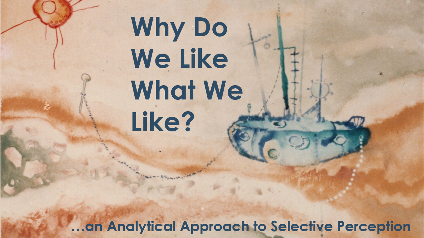
Mainly vision enters in contact with a picture first. We perceive it, we primarily process what we perceive (optical + chemical + nervous cycle) and, of course, we interpret it always from a unique, individual perspective that comes from ‘our own world’, the one conditioned by what we perceive while is conditioning this perception at the same time …OMG, what an apparent jigsaw!
For example, why do I like the previous image (accompanied by the article title in this case) from all the ones that I’ve produced in my ‘artistic life’ as a painter? Honestly, it’s far from being an outstanding example of syntax perfection, perhaps. Then it has to be semantics, or what the picture means from its historic moment or circumstances. Following the thread, the elicited emotions play a key role in my preference, I’m pretty sure.
Mainly watercolor and liquid techniques on heavyweight canson paper, I really couldn’t explain WHY I like the picture, one of my simplest ones. Perhaps I felt so satisfied after finishing it (my first timid attempts with a very risky technique, beyond the general undervaluation that has always suffered in art). Curious fact: I forgot its name, so if you could help me ‘baptizing’ the painting please suggest a title! (bernardo@bernardofacta.com).
WE LIVE IN OUR OWN, PARTICULAR (SELECTIVELY PERCEIVED) WORLD
The ‘map’ from famous NLP basic axiom aims precisely towards this undiscussable point: every single one of us experience differently the universe around (and inside).
Only ‘five cents’ of what happens during perception process (neurology, chemics, psychology, etc.) would take several times the length I want for this writing, so let’s go with some ‘drops’ of the thing:
TRANSDUCTION is the transformation of environment energy into electrical signals, exactly what our nervous system does while perceiving ‘reality’ by sending the signals to cortical receptors in order for our brain to acknowledge ‘what’ is out there.
The ‘what’ depends always on ‘what’ we want/would like to perceive, anyway! Albert Hastorf and Hadley Cantril published in the 50’s a study that clearly shows how we usually distort perception based on our deep beliefs and other factors: we perceive what we want, in other words.
Also Dr. Shannon Whitten (University of Central Florida), in the line of other psychology experts, clearly states how perception biases are the usual thing in all of us humans, permanently creating ways of mis-perception from automatisms, habits, prejudices, preferences…
(b.t.w. we have in bf© fantastic courses and stuff around Unconscious Biases in perception, judgement and decision-making, usually delivered to Managers, science-researchers, professionals and any individual wanting to grow through identification + management of own biasing apparatus)
Finally is Robert Pepperell (Cardiff Metropolitan University) being puzzled by the baffling fact of biological structure (eyes and brain), measurement of electrochemical impulses and electrical fields generated by neurons, etc., failing to explain the identification of vivid colors, textures, and objects in our conscious awareness. As he mentions, Rene Magritte famous ‘pipe that is not a pipe’ could perfectly become a symbol of this apparent contradiction.
Anyway, distorted ways of introducing info into ourselves is something we all share. My hugest interest is to find out what makes us different from each other, and this should add psychology + life-experience aspects to all of the previous stages.
In fact, Dr. Rex Jung (among other eminent neuro-scientists) knows well that our unique DNA is like an instruction book (the kind some furniture giant shops provide to arm tables and cupboards), thus somehow conditioning PART of what the being will be. The other part, making the person even more unique, is the sum of life experiences from early childhood (extremely influent ones) to the moment of the current choices.
This way, if my favorite color is green (let’s say) this probably has to do with something having happened to me during my life until this moment of preference, a preference that will condition a lot my perception of an artistic picture, for sure.
Emotions, impressions, experiences lived alongside our existence are cause and conditioning channels to perceive the world in which we live, so: the world we create.
This world is in good part unconscious, reason why Dr. Sigmund Freud said once that ‘we don’t choose other ones randomly …we find these ones already existing in our subconscious mind’.
Preferences on people, places, colors, types of weather, political ideas or art forms come, then, from a myriad of factors of uniqueness that have always fascinated me.
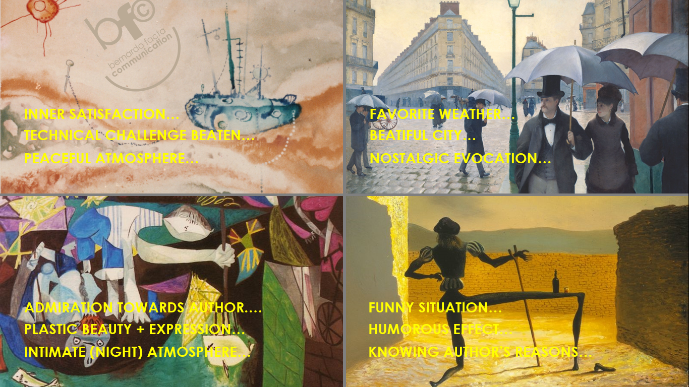
Now let’s go for the part in which I tell why I think that I like the pictures I like 😊![]()
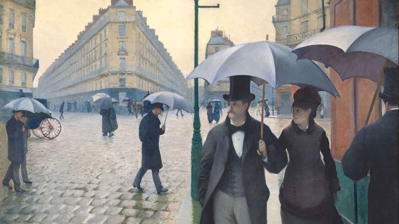
‘JOUR DE PLUIE A PARIS’ (Gustave Caillebotte)
Fascinating work (oil on canvas) of great dimensions (212 x 276 cm) which poetic realism reflects vividly the rain (that I love) over Paris (that I love). Part of the collected images from the painter (and gardener, in fact) in a book from him that I received as part of the ‘reward’ for having won an artistic contest ages ago (Alliance Française), it was the beginning of a ‘French affair’ that ended with a scholarship in Paris (‘beaux-arts’) offered by the French government. All of this together perhaps explain my ‘good feelings’ towards this picture, even if ‘Les Canotiers’ (i.e.) could have also been a choice from Caillebotte. Hope you find the explanation minimally logic.![]()
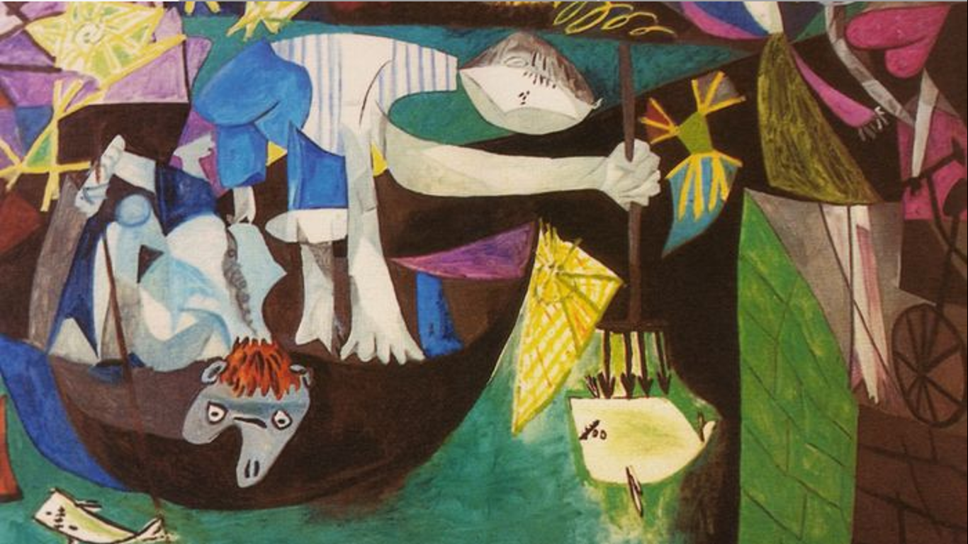
‘NIGHT FISHING AT ANTIBES’ (Pablo Picasso)
I guess it’s far from his most famous pieces of creative+artistic production. Even thought, it was a ‘first-sight love’ for me. Of course first conditioning factor could be my eternal admiration for the great master. Afterwards, the expressive shapes + colors help surely call my attention, besides the calm, almost intimate atmosphere (despite the urban context) covered by night typical mystery. Picasso’s iconography transferring ‘life’ to faces, fishes and even objects play an obvious role here. I like every part of it, including the simple black-lined bicycle that a lady watching from the dock of the port is holding with one of her hands. Finally, being green, turquoise and blue my favorite colors, I find there another explanation for my choice on this work (oil on canvas, 206 x 345 cm).![]()
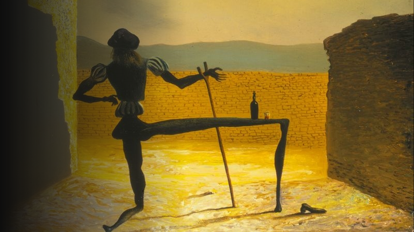
‘THE GHOST OF VERMEER VAN DELFT WHICH CAN BE USED AS A TABLE’ (Salvador Dalí)
Well, ‘sorry’: Dalí has never been my favorite painter, even if I got stunned more than once by his technical level and imagination. In ‘the Ghost…’ case is my (huge) humor side what gets called first by this tiny picture (oil on panel, 18 x 14 cm), as more than one analyst seem to know about the Catalan master ‘hate’ towards Vermeer because of his unachievable perfection (chiaroscuro, textures, atmosphere, etc.), which was apparent cause for Dalí’s envy and wish of vengeance 😊 So, we see Johannes Vermeer in a ridiculous shape + position, a composition that produced a nice laugh to me the first time and I came to enjoy even more while acknowledging the eventual origin of the thing.
PERCEPTION, AFTER ALL…
As we can see after the short description of ‘reasons’ for my artistic choices, it’s pretty clear that I perceive, interpret, and choose always from my unique ‘perspective’ (personality patterns, deep inner beliefs, psychological characteristics, etc.).
Emotion (loving the rain, and Paris), preferences and tendencies in visual art (shapes, colors, ‘expression’), or inclination to humor, have strongly influenced my attraction towards the 3 last works. For the first one, even deeper cords have been surely activated from inner feelings, experiences, evoking memories, etc.
All of the neuroscientific implications, together with the psychological ones, etc., will be up to your will of thinking about the matter. I just wanted to stop for a second to ask myself ‘why do we like what we like’. That’s it!
‘Til the Next one,
B (Sr)
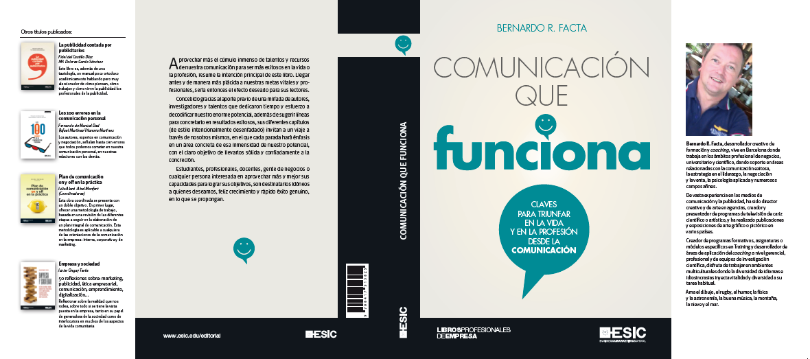
BOOK PUBLICATION …WHAT’S IN FRONT & BEHIND?
Book on the shop-shelf is just the final result …what about the rest?
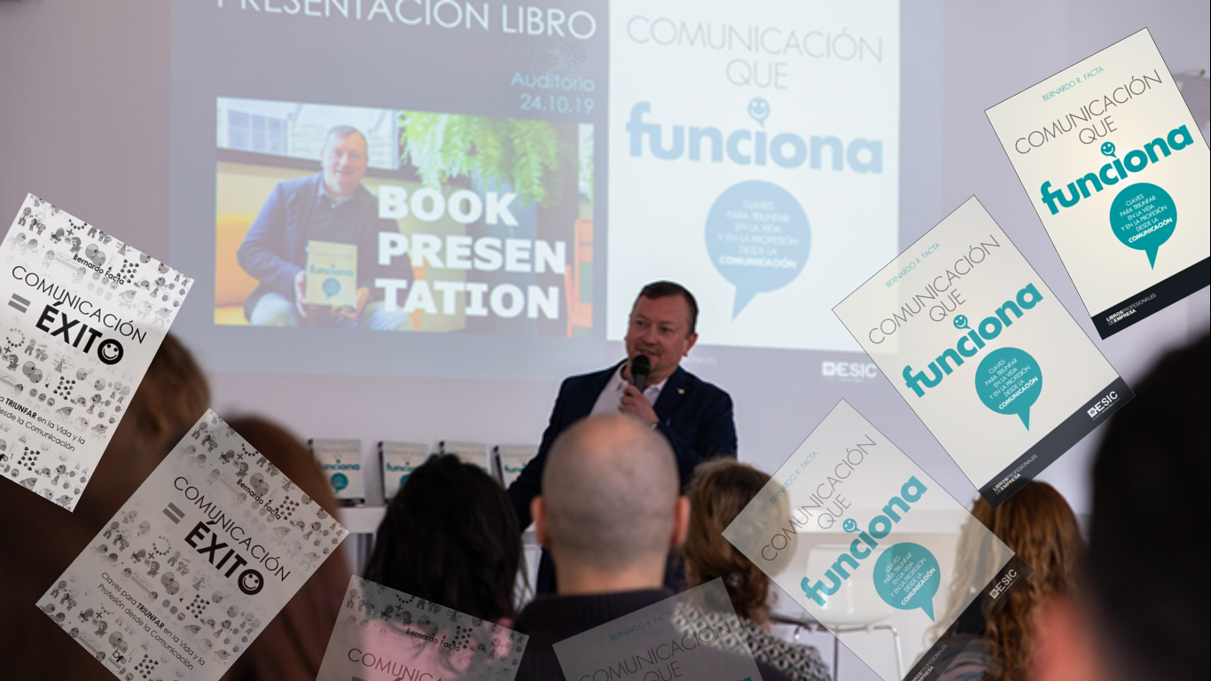
‘COMUNICACIÓN QUE FUNCIONA’, Bernardo Sr.’s recent book, was conceived about a year before its publication, under a different title: ‘COMUNICACIÓN = ÉXITO’. Let’s tell a bit about the embryonic stages of creation/development until arriving to this key point (title).
a) WILL + CONVICTION: the writer gets inspired by the muses’ ray, or simply conceives (at once, or through sum of moments/factors) the idea of a book. Then, some analytical approach is needed to finally decide on the respective writing task, convinced of it being necessary/useful to somebody in the future (the readers). I was asked several times (during years) by my students, professional attendees to business courses, etc., to put in a book what I usually managed at the class or training room. So, I got convinced at certain point that it could prove useful to lot of people the fact of arming a book (or something alike 🙂 condensing the best from communication learned from many wise people having worked hard during centuries for us to know now how to use this power in successful way.
b) FIRST DRAFTS: the author takes time to work with involved concepts and main elements in the final ‘architecture’ of the book, thinking of subjects, their division in chapters, etc. Then, first constructive lines begin to appear. I took first all of my courses delivered in universities, companies, and science centers, to have a ‘big picture’ on what I could be covering from my true knowledge and experience. Afterwards, I did a mental arc of development (from ‘simpler’ to ‘more complex’ or ‘conclusive’) in order to see how I could build the different chapters, and with what strictly. Finally, I let my mind and hand be free to create the most fluent possible message, in order to prove useful + entertaining at the same time (at least this was the intention 🙂
c) MAIN BODY WRITING + ANALYTICAL REVISION: ‘work’ itself for any writer. Necessary time to let ideas get out, catch them as well as possible, and pouring them through words to the virtual/real blank paper. Whenever finished, a comprehensive look to the whole thing is always needed, in order to analyze, test homogeneity and style, etc. I consider myself anything but a writer, to begin. Just a trainer that wanted to share knowledge through a printed product in order to reach more people. That’s it. It took me some couple of (or perhaps three) months the task of arming the whole book. For 500 pages (493 in the end) it can seem a short time. The point is I knew from the beginning what I wanted, and had lot of base material to work with. Before contacting publishing houses, I checked carefully the main approach angles previously expressed.
d) SEARCHING ‘THE’ PUBLISHING HOUSE: in a so diversified market, to find the right editorial house for the right book is all of a task. Then, following steps are: being taken into account, contacted, offered a possibility, profiting it. In the Spanish editorial market, according to surveys, only 1 book from 70 proposals is published! ← I knew about this, being thus unsure about my book’s true possibilities of arriving to be published. After some personal research and analysis, I chose some 20/30 well-known publishers specialized in my type of book, and sent a written proposal with incidence in (my opinion about) best points and possible benefits for publishers/readers. I received only few replies, fewer even with some ‘hope’ of possible consideration by professional analysts, etc. Among them, a true ‘giant’ was topping the list: ESIC Editorial (from ESIC Business & Markeging School) …I couldn’t believe.
e) PARTNERSHIP PUBLISHER-WRITER: after evidenced interest from the publishing house, a synergyc set of evolving steps take form, from initial mutual understanding on goals to be achieved, through definition on each side’s part of the work, to final successful production of an homogeneous volume with true possibilities of being sold + appreciated by the main target (specific public sector). I was contacted first by Arancha Rivero García-Salcedo, that informed about the editorial interest in my book, then asked if I could condensate the respective material into 175 pages for ‘scientific dissemination’ format (17cm x 23cm), to what I replied that it could be better to publish it in ‘big format’ with the whole 500 pages, perhaps splitted into 2 consecutive volumes (justifying my opinion in the ‘already condensed’ characteristic of the whole book). In the end, they decided to publish it ‘complete’ in a unique book. To summarize the thing: main interchange of emails (about 80 as a whole) throughout the evolving process was about successive corrections from my/their part in order to polish grammatical side + most proper way of expression, word by word (exhaustive and exhausting!). Before the ‘final cut’, I was suggested by Gema Bolaños Sánchez to consider a new title (the final one) suggested by Vicente, their creative director, in order to better cope with the web-searchers and other marketing + business considerations, to what I completely agreed. As a funny point, when I received their proposal for the book cover (designed by Gerardo Domínguez, with layout by Santiago Díez Escribano) I just suggested to add some expressive emoji to the thing: they put it in the front cover, back cover, spine and everywhere! 😊 I’ll always remember this kindness (among lot of others from their part) with full sympathy.
f) PUBLICATION + MARKET LAUNCH: the presses finish their work, the book is distributed, critics evaluate it, the public finds out that it exists and, perhaps, buys it. I was asked in the beginning (by ESIC) which books could be competing with mine in the market (fortunately not that many at that moment), because of an evident interest in potential for commercial success once published. In ‘COMUNICACIÓN QUE FUNCIONA’ case, we were lucky enough to receive positive comments from specialized press, inviting people in general and professionals to read it. Fortunately main usual stakeholders (Amazon, Fnac, la Casa del Libro, El Corte Inglés, and many others) were also committed to the task of quick distribution in physical shops + availability through internet command, etc. First weeks were so promising in terms of sold copies too. Some universities incorporated the book to their libraries (as consultation material) and it begun to be sold also abroad.
g) BOOK PRESENTATION + MARKETING/ADVERTISING ACTIONS: the author attends presentation events (a so traditional ‘ceremony’) where to speak about the own book and , eventually, sharing stage with guests that, at their turn, speak about the writer and its volume too. Sometimes, the book is sold during the presentation event. Besides this, every opportunity to spread the word helps (internet, editorial events, etc.). I presented my book in different business events (being the one at the Sellbytel Group among the best ones), as well as in some universities and, finally, under the ‘umbrella’ of the famous Sant Jordi celebration (Catalan day, extended to whole week, where to highlight books and roses). Even if I hate to sell directly (perhaps shyness or something alike) the tradition was respected and some copies went from my hand to new buyers’ ones. In addition, and after lot of years, I signed up many books (as I did in my early teen-age and youth with editorial/comic characters in press exhibitions), kind of ‘rejuvenating’ in the meanwhile.
…and that’s it! At least by now. ‘COMUNICACIÓN QUE FUNCIONA’ is still being sold at good rhythm, and becoming a useful tool for many different goals in the academic, business and science environments.
I still consider myself much more a ‘disseminator’ rather than an author, and thank a lot the many authors and sources used to give form to this book. Some people repeatedly asked me about a further one, to what I simple replied …’whenever I turn to feel same inner will and conviction’ and, mainly, if I find that again ‘I have something to say’.
Hope you liked the thing, and here’s a link (from many) to buy the book in case of being interested in growth + success (hehe, what else can I say about my own ‘creature’?).
‘Til the Next one!
B (Sr)
VISUAL IMAGE SYNTAX or HOW TO DECODE THAT PICTURE YOU LOVE SO MUCH 😊
It happened more than once that my Students in Art hated me after a class of such an interesting topic. Why? They found themselves unable to ‘just enjoy’ the next pictures after having learned to decodify their syntactic, morphologic ‘secrets’.
Well, it’s the price to pay for acquiring new knowledge and, perhaps, after having claimed a bit, they begin to enjoy pictures even more. For sure, more in depth.
Here we go with the essentials I’ve learned about Visual Syntax alongside my long way as Art Professor, and good thing about this is: it is applicable to any type of visual picture (including comic strips or satirical illustrations besides any Picasso or Bacon masterpieces).
SYNTAX & SEMANTHICS (or SHAPE and MEANING)
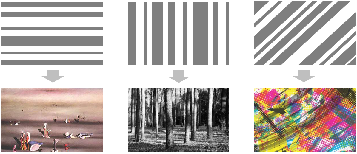
Points form Lines that at their turn form shapes or linear patterns in pictures, where:
HORIZONTAL dominants mean CALMNESS and TIMELESSNESS.
VERTICAL dominants mean STABILITY and FIRMNESS, and
DIAGONAL/OBLIQUE dominants mean DYNAMIC and UNSTABLE, like in the following examples:
More yet on Lines: they transmit higher SENSITIVITY if ‘handwritten’ style, and PRECISION if geometric ones (WARMER and COLDER could also be an eventual way of interpretation).
The first ones build usually ‘PHYSIOPLASTIC’ shapes (ORGANIC, NATURAL, LIVING forms).
The second ones, ‘IDEOPLASTIC’ shapes (INORGANIC, IDEALISTIC, EXACT forms).
Shapes themselves can be, in addition CLOSED or OPEN (examples below), what normally means more or less SIMPLICITY/DEFINITION: our brain likes to identify simple structural or objectal forms like circles, triangles, or squares.

Pictures can have ÆSTHETIC (beauty) and EXPRESSIVE (strength, impact) POTENTIAL, and usually present 3 main qualities: COLOR, LIGHT and TEXTURE (self-explaining all of them).
DARKER colors make SHAPES SMALLER, LIGHTER colors make SHAPES BIGGER as a general rule.
WARM colors (red, orange, ochre, etc.) bring the image CLOSER, while COLD colors (blue, turquoise, emmerald green, etc.) move the image FARTHER.
Colors also act in COMPLEMENTARY (opposite place in the chromatic circle, like yellow & violet, blue & orange, etc.) or SUPPLEMENTARY (‘neighbors’ in the chromatic circle, like red & orange). This follows a simple logics: being RED, YELLOW and BLUE the Primary colors, each one of them has as opposite the combination of the other two, and as ‘neighbor’ a combination between them and one from the other two.

CONTRASTS (black/white or yellow/violet, for example) CALL for ATTENTION as well as harmonic SHADING COMBINATIONS appeal to a SOFTER, calmer approach to the image.
THE FIELD ACCORDING TO GYORGY KEPES (one of my favorite masters for this):
‘FIELD’ is the whole picture, that we can READ from the following syntactic principles in order to better understand WHY and HOW they impact ourselves in certain, CAUSAL ways:
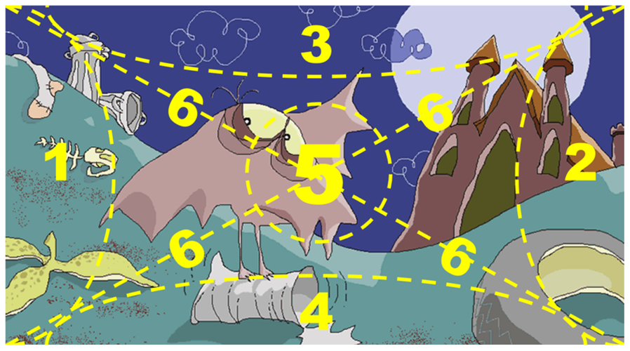
- BEGINNING of our PERCEPTIVE path (in Occidental cultures, at least, as we perceive same way we read written texts, in this case: from Left to Right).
- CLOSURE of PERCEPTIVE path.
- HIGHER (visual) WEIGHT, as being the sky normally unlimited (differently from pictures of it) we find ‘anti-natural’ the upper limit in images.
- NORMAL WEIGHT, as we are used to the ground as a bottom limit to our visual reality.
- MOST IMPORTANT area (starring role always in the center).
- DYNAMIC areas (let’s remember this potential in Diagonal/Oblique lines, real or tacit ones).
Finally, let’s know that the Picture can show UNITY or VARIETY, or a combination of them as an average from its different compositive elements, what we interpret the following way:

From these two qualities (UNITY and VARIETY) we can extract the 5 necessary SYNTAX ANALYTICAL FACTORS (Balance, Structural Scheme, Proportion, Rhythm, and Key Interest Points), all of what we’ll describe in a following article that complements + completes this one (bit of patience, please!).
‘Till the next one,
B (Sr)
CAKE·ART
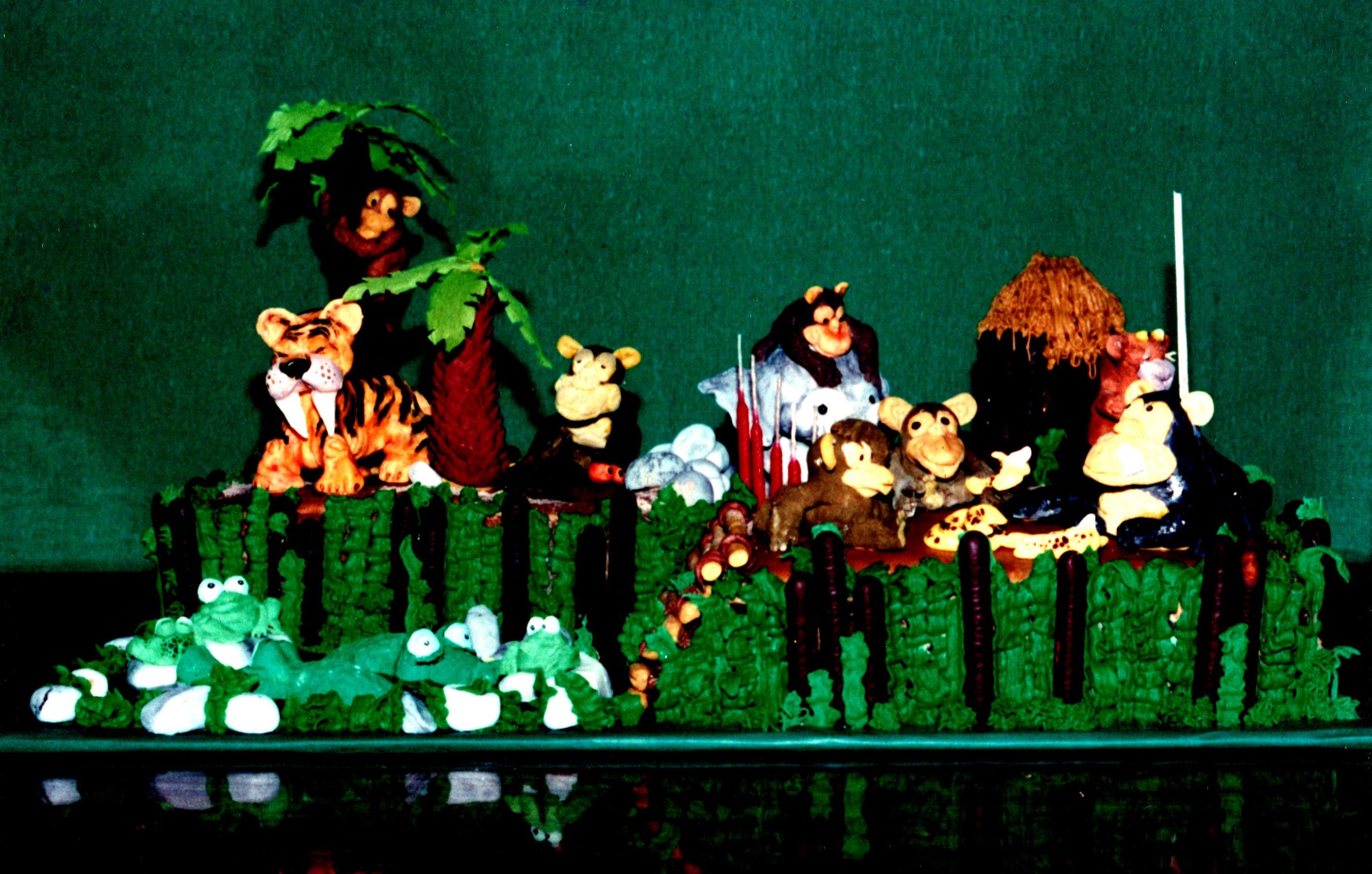
Even if I’ve been a mediocre-to-average father for my son and daughter, one good thing I did during their childhood was to help Mome Xtina build the best Birthday-cakes ever 😊
They were always ‘thematic’ (in the photo: a ‘jungle’ one for Bernardo Jr. on his 7th birthday) and 100% edible+digestible, what meant for every element there (in our present case: animals, huts, log fence, water, vegetation) to be shaped and built with healthy pastry materials, including ‘sculpture’ (Marzipan, almond paste, etc.) and ‘painting’ (concentrated colors for confectionery and pastry).
Only thing around this ‘art’ being: it’s so ephemeral! 😊 Normally our children’s classmates were devouring the pies in a heartbit.
On the other hand, good memories of having worked as a true Team (Xtina designing and cooking, me shaping and painting, our children devouring) remain intact today, inspiring us to continue doing so in our current ‘bf©’ engagements.
‘Till the next one!
B (Sr)
FOR LOVE OF ART …LESS IS MORE!
Black and white photos are considered normally ‘more artistic’ than color ones …Why?
Simple: they give less information to the observer (only shapes, structures, contrast, degrees of light), what allows her/him to ‘project’ there the colors they need or want to see, by following the natural tendency of brain about completing what seems to be incomplete (in the photos case, the color side).
Thus, this eventual person will be feeling free to ‘mentally paint’ the original stimulus being offered to their assimilation. This higher interaction between public and piece of art is much appreciated when having to consider the ‘artistic quality’ of the image, sculpture, film, etc.
Something alike happens in communication!
The ‘unspecific language’ so used in Ericksonian-hypnosis (i.e.) is about using generic terminology in order for the receptor to assign their own specific meaning to each piece of emitted message, what will be making them feel so identified with it in the end. This is about high power of persuasion, among other evident advantages for the emitting side.
Same circumstance, under the NLP lenses, is called ‘inverse meta-model’ and aims towards the same goal: for the interlocutor to complete by themselves meaning in order to feel more involved (persuaded).
Communication, then, is sometimes another form of art, if we honor it through proper management of its whole potential.
Both in art and communication, anyway, the more we consider ‘the other one’ for having active participation in the shared experience, the better.
‘Til the next one!
B (Sr)
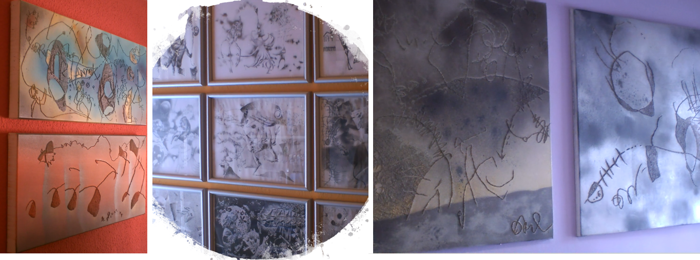
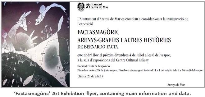
EXHIBITIONS …WHAT’S IN FRONT & BEHIND?
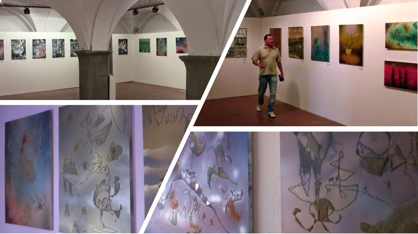
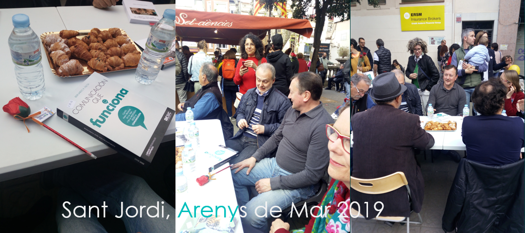
Pictures on the wall is just the final result …what about the rest? We’ve taken ‘Factasmagoric’, a Bernardo Facta (Sr.) exhibition in the Calisay Cultural Centre (CCC, Arenys de Mar, Barcelona) to paint ( 🙂 ) a rapid outlook about an interesting process that ends with the public interacting with the artist production:
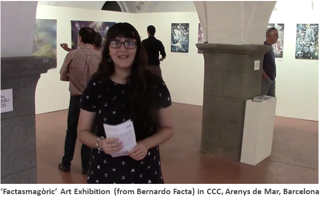
a) INSPIRATION: the artist gets involved in the artistic task while being helped by the muses (if they exist), and likes to make the inner thing visible to others in the external world. If an exhibition in mind, some points should be taken into account besides the resolution of each picture itself, as i.e. coherence and homogeneous relationship with the rest of the material to be exhibited (style, techniques, themes, etc.). I got inspired by life in Arenys and other places, by the sea, by the local habits, customs, and festivals, etc.
b) SEARCH: the artist looks for (normally) or is called with (less normal) the opportunity to show the own artistic production by an exhibition that will be lasting during an agreed period, usually a month or so. I contacted the Department of Culture of the City Hall of Arenys de Mar, that liked my proposal and suggested the biggest gallery of their Cultural Centre for a 30 days exhibition. Great!
c) CONCEPTUAL AGREEMENT: together with the curator of the exhibition (or gallery owner, eventually) the artist agrees on the main conceptual sides of the thing, as i.e. thematic definition, type of works and their respective techniques, quantity and variety, etc., already taking into account the symbiosis with the physical space assigned for the exhibition. I met Mr. Enric Pera, who gave me the gallery plan with dimensions of each wall, and possibilities of lighting, furniture, musical equipment, etc. to adapt to this the quantity and size of the pictures. 70-odd seemed a good number, and would vary from large ones (about 2m x 1,5m) to small ones (50cm x 70cm on average, + couple of additional miniature). The room had a perimeter of some 40 m, and the main linking idea for the overall exhibition would be a figurative style with expressionist and caricatural tendencies, worked in mixed techniques with both conventional and non-conventional materials.
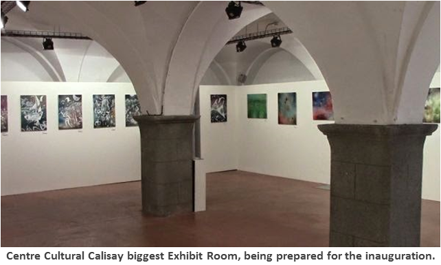
d) ROOM SET-UP: in some cases (like this one) the characteristics of the room vary from exhibition to exhibition in order to adapt to every new requirement. The walls color, and the light and (eventually) sound are crucial factors to suggest a particular atmosphere to the public, always in accordance to the primary spirit of the shown works, and their core characteristics. In our case, the whole room was painted in white for better contrast with the mainly dark pictures to be exhibited there (previous color of the walls was dark purple). Lights were distributed in homogeneous way in order to easy perception without accessing the works in direct way (bit of diffusion was convenient according to my humble opinion) and the suggested music was delicious instrumental bossa nova with some contributions from melodic pop 🙂 Joan Carles, art and history expert of the CCC, gladly agreed with the choices.
e) EXHIBIT ADVERTISING AND INNER MEDIA SUPPORT: with convenient anticipation, is good to announce the event (opening and duration of the exhibit) by the proper means, always calling for interested public to accompany the experience and (if possible) to buy! Sometimes is also advisable to add information indoor, as i.e. signs with interesting data, photos, etc., some videos, or whatever add that both curator and artist could consider proper. The Centre Cultural Calisay took responsibility for the great signal to be placed in the front part of the building to announce permanently the exhibit to people in the street. Besides this, same people printed flyers, posters, and brochures in different sizes, some of them to be placed all around the village, some others to be picked directly from the gallery. Some text that I had to redact with my personal data and info on the display was showed in big typography size on the gallery walls (brilliant printing work, really!).
f) HANGING, MEASURING, DRILLING… the task of putting everything in place deserves special focus: normally both curator and artist agree a specific plan of distribution that takes into account diversity of conditioning points (as i.e. main technique, common theme, same production time, dominant colors, etc.), and specialized operators are in charge of making this appear in reality, always before the inauguration if possible 🙂 Several persons led by Santi were coping with the millimeter placement of each work inside the CCC biggest exhibition room, according to the plan I passed to them previously, solving in real-time every eventual inconvenience (normally relative to securing solid attachment of pictures to the wall). One of the largest pictures was slightly warped in one of the wooden pillars of its structure, and the operators made magic (with drills, screws and great ability) so that it was perfectly straight to the wall. Artists …of the set-up.
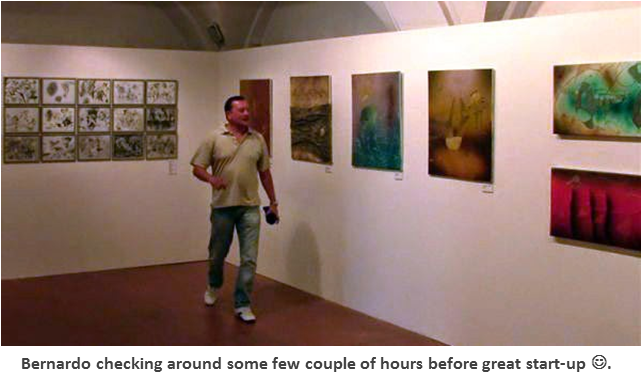
g) SOMETHING FOR THE PALATE: it’s a classic. Good champagne or wine + tasty mini-lunch makes public enjoy pictures more, or get distracted from them if not liking! Enough bottles of cava + dozens of sweet cakes were placed in a fridge near the gallery, in order to accompany the audiovisual stimulations during the inauguration still to come.
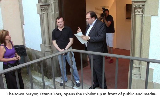
h) START-UP! : now yes, everybody knows what it’s like, and so less relevant for the purpose of this report. Anyway, ‘Factasmagoric’ begun with public success, and the Mayor saying some words of praise and inviting everyone to enjoy the art (or the cava with ‘pastitas’!).
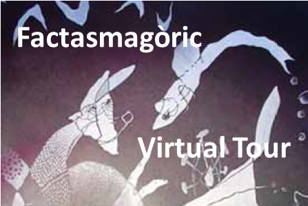
Hope you found this entertaining! In case of wanting to take a virtual tour of the exhibit, here’s the link:
LET’S HOPE YOU ENJOY!
3D ART (strange as … and usual)
‘R-BOT’ is part of the 3D experiences that Bernardo Facta is involved in, taking advantage of our stereoscopic, usual way of visual perception to extract from an originally 2D artwork the impression of 3D space in an observer equipped with 3D red-cyan anaglyph glasses.
An old idea having always motivated Bernardo, the visual result is kind of strange and usual at the same time: strange because of the three-dimensional elements that fulfill the scene, usual because of the spatial, stereoscopic sensation.
Let’s hope you enjoy! …and have the glasses, of course.
![]()
Otherwise, you can make your own 3D anaglyph glasses by simply using two pieces (one red, the other one cyan –blue is almost as good as cyan-) of any from the following materials: cellophane, acetate film, transparency sheet for overhead projectors, etc. You can place the two colored pieces in a pair of glasses frames no longer in use, or you can cut the frame out in paperboard/ cardboard. Now you can certainly enjoy 3D!
‘Til the next one ●
(Link here for ‘WHY DOES THE 3D THING FASCINATE US REALLY?’ article)
JUST CONTACT US IF INTERESTED IN DOING OR BUYING ART!
![]()